Playing around with data visualization
March 23, 2025
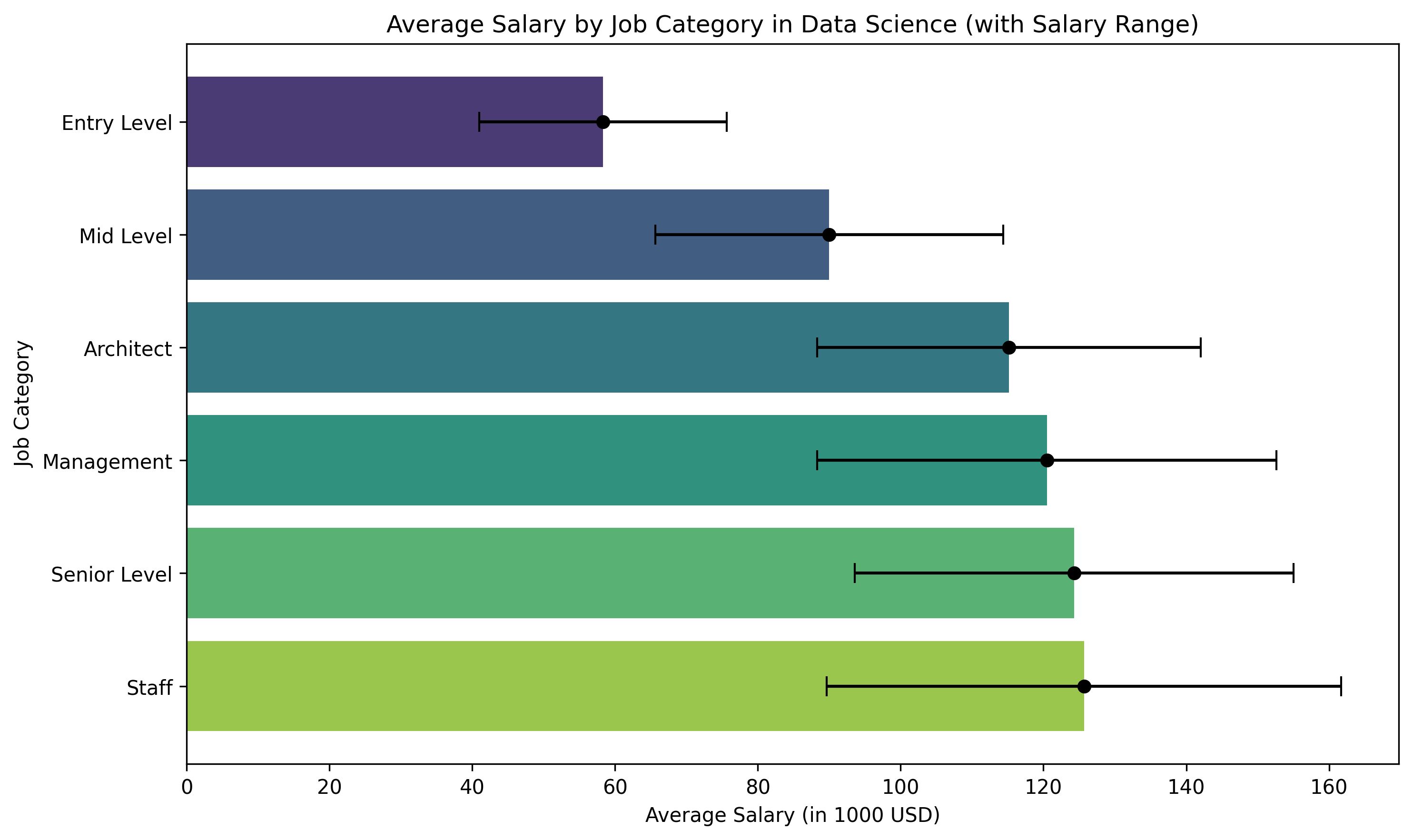
This graph was created in python with matplotlib and seaborn. The logic is
98% courtesy of ChatGPT. The data is from
Kaggle.
It's salary data from 2021. For more info see the dataset in the link.

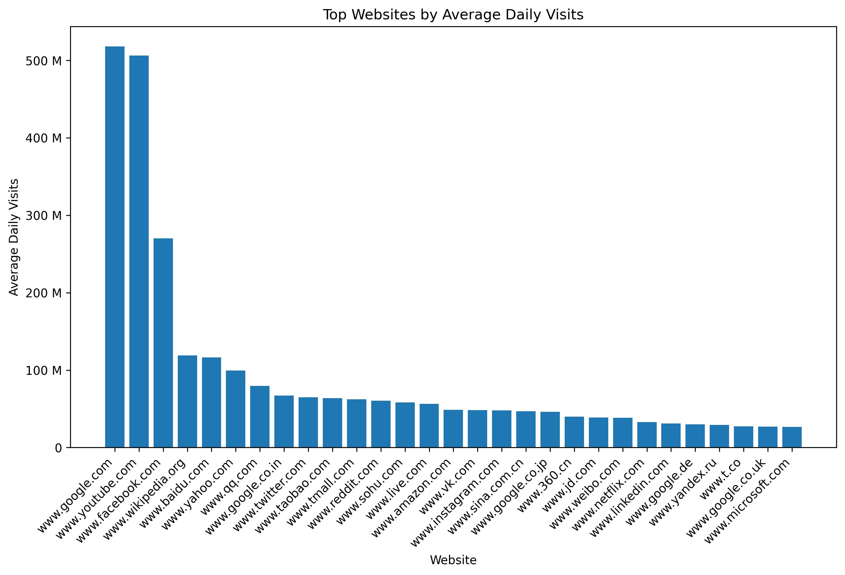
The reason I started playing around with data visualization was my reading about long tails in "The Psychology of Money" by Morgan Housel. I thought it would be nice to have that visualized. So here goes a chart of a long tail. The data is from here.

Morgan Housel describes how in finance, most of the earnings come from a diminishingly small number of assets. Most assets will fail and that's fine. It's enough to have a few or even only one asset that drives the entire gains.